Documentation
Show Contacts Module
Joomla 4, joomla 5 and joomla 6 compatible.

Contacts settings
- Category
- Tags
- Sort Order
- Default Letter
- Name - Yes / No
- Show last name first? - Yes / No
- Link name to full contact - Yes / No
- Contact's Position - Yes / No
- Street Address - Yes / No
- City or Suburb - Yes / No
- State or County - Yes / No
- Postal Code - Yes / No
- Show postal code first? - Yes / No
- Country - Yes / No
- Miscellaneous Information - Yes / No
- Custom Fields - Yes / No
- Category - Yes / No
- Telephone - Yes / No
- Telephone Icon - Yes / No
- Link Telephone - Yes / No
- Mobile Phone - Yes / No
- Mobile Phone Icon - Yes / No
- Link Mobile Phone - Yes / No
- Fax - Yes / No
- Fax Icon - Yes / No
- Link Fax Number - Yes / No
- Email - Yes / No
- Email Icon - Yes / No
- Link Email - Yes / No
- Webpage - Yes / No
- Webpage Icon - Yes / No
- Link Webpage - Yes / No
- Image - Yes / No
Team Module
Joomla 3, Joomla 4, joomla 5 and joomla 6 compatible.

Custom items
- Publish/Unpublish
- Image
- Video ( opens in popup modal )
- Name
- Main Title - Position
- Main text - Bio
- Twitter X
- Tiktok
- Discord
- Telegram
- Github
- Dribbble
- Flickr
- Tumblr
- Youtube
- Vimeo
- Vk
- Read More

Load articles
- Select Category
- Child Category Articles - Include / Exclude
- Category Depth
- Tag selection
- Featured Articles - Only / Hide / Show
- Article Field to Order By - Article Manager Order / Featured Articles Order / Hits / Title / Id / Alias / Created Date / Modified Date / Start Publishing Date / Finish Publishing Date
- Ordering Direction - Descending / Ascending
- Count
- Open Link - New Window / Same Window / Popup window
- Article Custom fields - Yes / No
- Category Title - Yes / No
- Item Title - Yes / No
- Title Max length
- Description display - Yes / No
- Description Max length
- Show Read More
- Images settings
- From Image Intro - Yes / No
- From Image Full text - Yes / No
- From Inline Intro text - Yes / No
- From Inline Full text - Yes / No
- Order to Get
Folder source
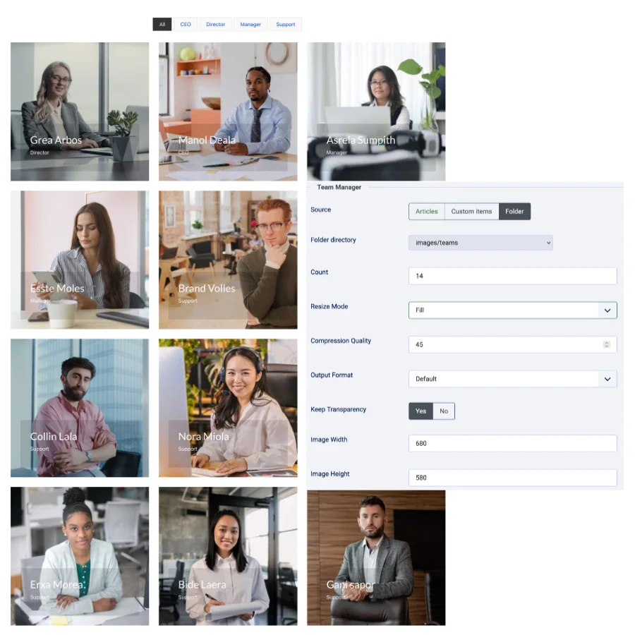
In the module settings, set Source to Folder.
The selected folder and its subfolders are scanned recursively. Supported extensions are jpg, jpeg, png, gif, webp, bmp, and mp4.
Folder filename format
Use the filename without its extension to provide the person's name, title, and description:
01 - Jane Doe | Creative Director || Designs brand systems and campaigns.jpg
Use this recommended pattern:
ORDER - NAME | TITLE || DESCRIPTION.ext
Numeric prefixes
A leading number followed by a separator is removed from the displayed name and title. These examples display as Jane Doe:
01 - Jane Doe.jpg
02_Jane Doe | Designer.jpg
03. Jane Doe | 02: Lead Developer.jpg
Hyphens and underscores inside the remaining text are displayed as spaces. The original filename and image URL are not changed.
General settings
This section covers the remaining controls in the module's Settings tab. Settings that appear only for a selected Style, Version, or enabled feature are marked below; Joomla hides them when their condition is not met.
Style-specific controls
| Setting | Description |
|---|---|
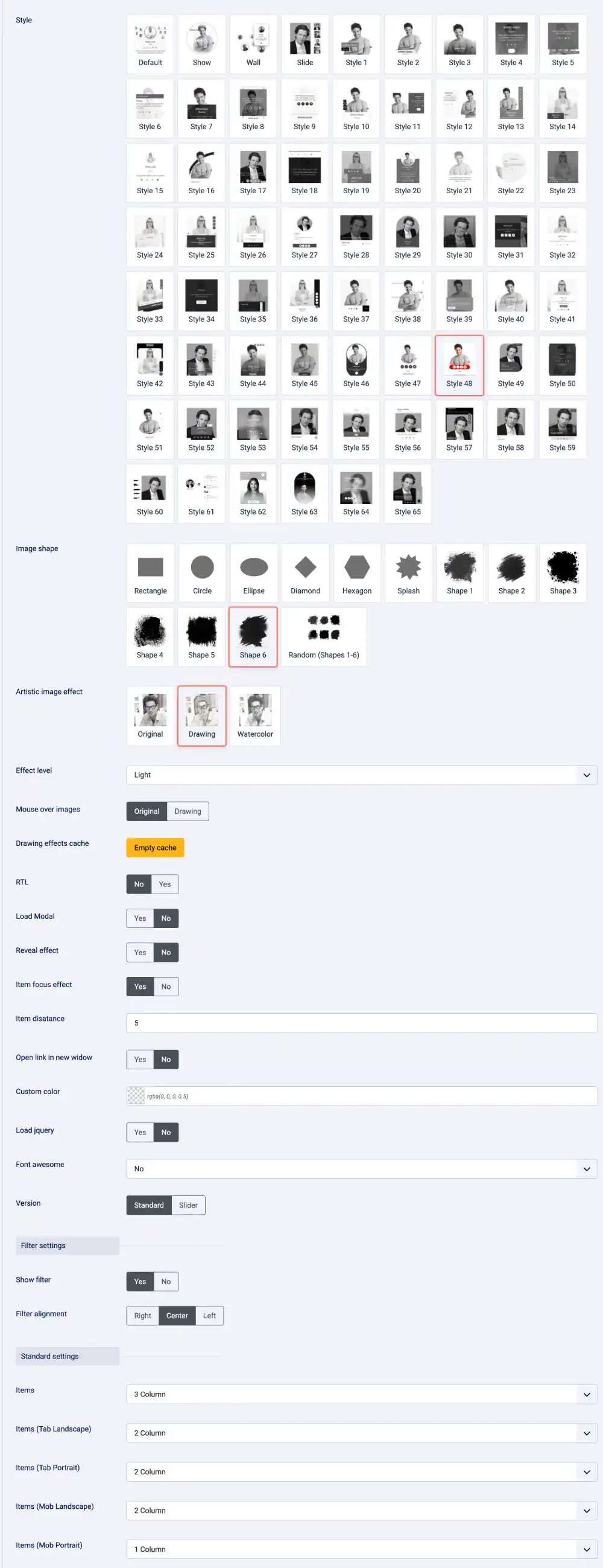
| Style | Default, Show, Wall, Slide, and Style 1 through Style 65 (69 options total; default Style 1). The selected layout can affect which other controls and content fields are used. |
| Style version | Only for Style 63: Light (value 1) or Dark (value 0, default). |
| Image width | Only for Style 60. |
| Photo height | Only for Style 12: height in pixels; default 400. |
| Show background color / Text color | Only for Show: set the layout background and text colors with Joomla color pickers. |
| Custom color | A shared color value for layouts that support it. Leave empty to use the selected style's own colors. |
| Item distance | Numeric spacing in pixels between team members in layouts that support it; default 0. |
| Item focus effect | Enable or disable the layout's hover/focus treatment; default No. Only styles implementing the effect will change. |
| Open link in new window | Choose Yes (_blank) or No (_self, default) for supported item, image, or social links. |
Site behavior and supporting assets
| Setting | Available choices and behavior |
|---|---|
| RTL | No (default) or Yes. Enables right-to-left layout behavior in styles that support it. |
| Load Modal | No (default) or Yes. Loads the module's modal support for member videos. Enable only when the template or another extension does not already provide the required modal script. |
| Load jquery | No (default) or Yes. Loads the module's bundled jQuery. Enable only if the site has not already loaded a compatible copy. |
| Font awesome | No (default) or Font Awesome 6. Load the icon library only if the template does not already provide compatible icons. |
Image resizing applies to image files used by Articles, Custom Items, and Folder items. The module's common image helper processes the image when a layout asks it for the image URL, so the setting is shared across Standard and Slider presentation modes and across styles that render the item's image.
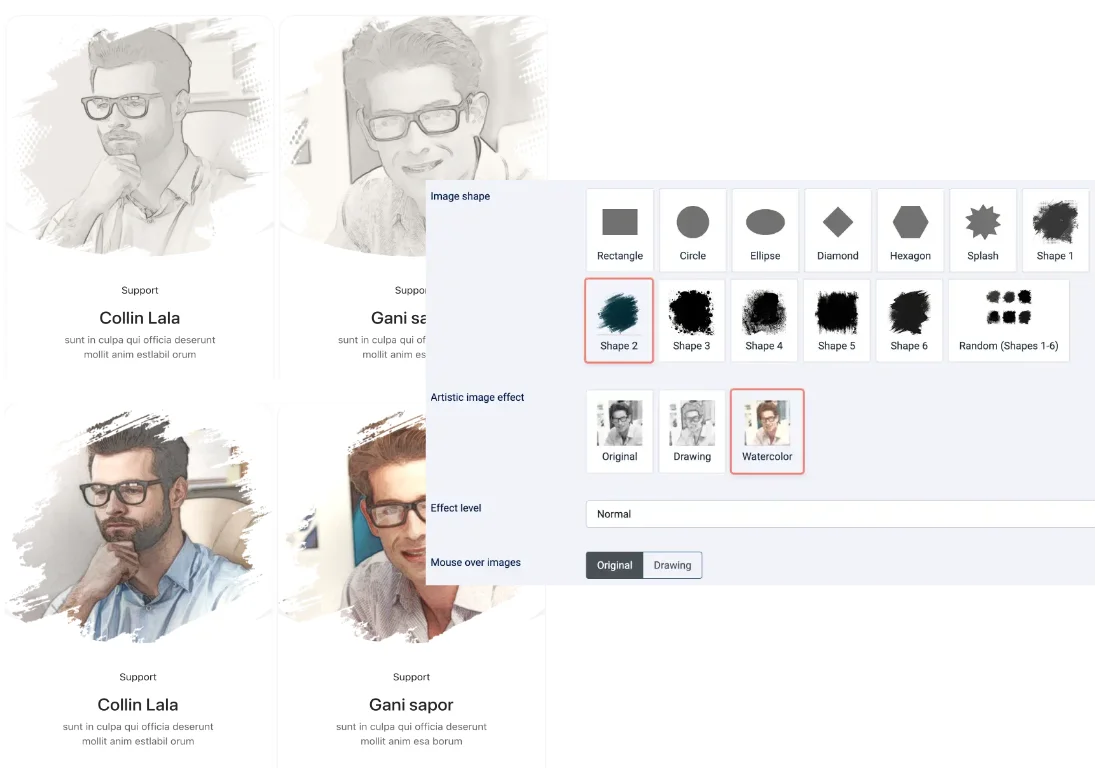
Shapes and Image effect
Image shape
Image shape is available independently of the Drawing image effect. It clips or masks the original images without converting them into drawings. Available choices are Rectangle, Circle, Ellipse, Diamond, Hexagon, Splash, Shape 1 through Shape 6, and Random (Shapes 1-6). Random assigns mask shapes across the images.
Animate image contours
Draw the image contours with animated SVG strokes in colors sampled from the photo and after display the photo.
Image effect
Image effect has three choices: Original (default), Drawing, and Watercolor. Drawing is optional in white or Sepia. Choose Watercolor directly to apply the color-wash effect; there is no separate color toggle. The effect is separate from Image shape, so either setting can be used alone or both can be combined.
- Effect level: Soft, Light, Normal, Strong, or Very strong. It adjusts pencil line strength for Drawing and pigment strength, pooling, and paper texture for Watercolor.
- Mouse over images: Original (default) temporarily shows the source image when hovering over the team item; Drawing keeps the selected processed effect visible.
Filter Option
Filters are available only in Standard mode. Show filter defaults to No; set it to Yes to add Isotope navigation. Filter alignment can be Right (default), Center, or Left. The Article filter by selector appears only for Articles when the filter is enabled; choose Categories or Tags (default). For Custom Items and Folder mode, item titles provide the filter labels.
Filter labels are derived from each displayed item's category, tag, or title. If an item has no label, it cannot be selected under a descriptive filter button. Slider mode does not show the Isotope filter.
Item distance is a numeric spacing value in pixels between team members; the default is 0. Item focus effect enables or disables the layout's item hover/focus overlay; the default is No. Both are layout-dependent, so preview them with the selected style.
Demo with filter

Slider Settings
- Items - one to ten
- Items (Tab Landscape) - one to ten
- Items (Tab Portrait) - one to ten
- Items (Mob Landscape) - one to ten
- Items (Mob Portrait) - one to ten
- Sliding Time
- Sliding Speed
- Auto play (Yes/No)
- Loop (Yes/No)
- Show arrows (Yes/No)
- Arrows style (top/bottom/center)
- Item distance
- Show next previous items (Yes/No)
Standard settings
- Items - one to ten
- Items (Tab Landscape) - one to ten
- Items (Tab Portrait) - one to ten
- Items (Mob Landscape) - one to ten
- Items (Mob Portrait) - one to ten

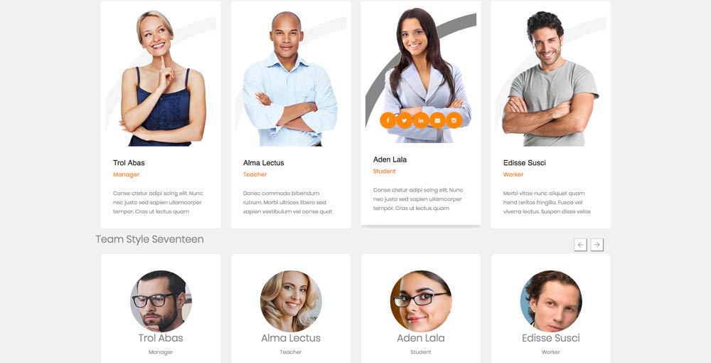
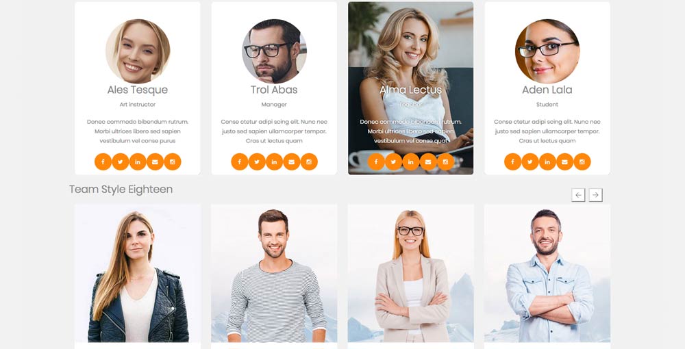
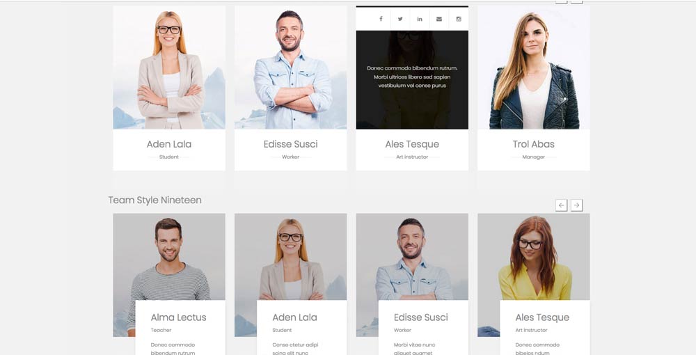
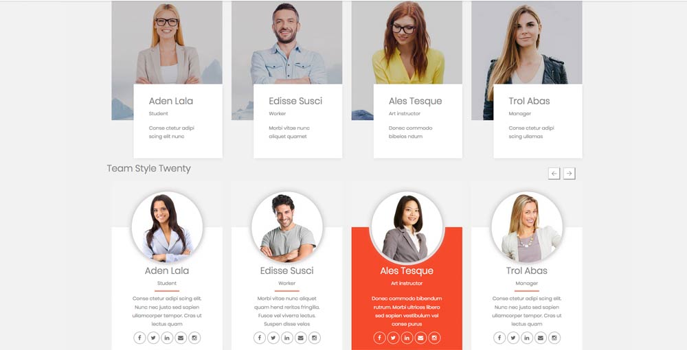
69 layouts
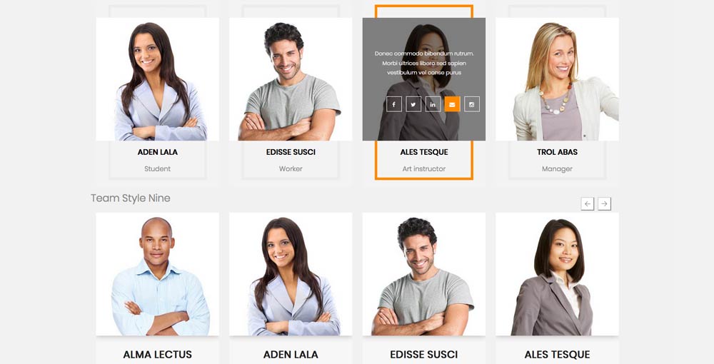
The default style is a beautiful wall style which shows all team members in animated way ( is limited till 10 items ). Show style is only in standard versions and has optional to choose background and text color. The rest of styles ( unlimited items ) are unique layouts and you may chose for each layout the color you prefer to have for your team members. The style and custom color, you may chose it in General settings.